19 Embarrassing Early Tech Logos
Long before tech companies earn their first billion or two and gain their max level ability to successfully undermine the very democracy on which the country they were made in was founded, they humbly start out as a couple of nerds' vanity project that comes together between their programming classes and their not getting invited to parties (it’s okay, we never were either). It is in this crucial phase that the very important act of branding is initiated, with some truly horrifying results. From the overwrought messes of too much design to the underthought first drafts that didn’t look at all the implications, these early designs really did not stand up to the test of time, as the companies using them clearly realized. Come along with us, and let’s go on a journey through the annals of the decades to see what bland, horrific, or downright ugly first takes of companies’ branding looks like.
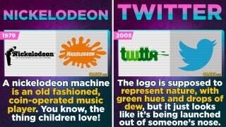
Nickelodeon

Source: The 7 Most Ridiculous Rough Drafts of Famous Brand Logos
Nokia's Fish

Source: The Branding Journal
Triple X Xerox

Source: Business Insider
Scary Naughty Dog

Source: Mishes
Groovy Microsoft

Source: Cnet
IBM

Source: Alphr
Old, Crotchety MySpace

Source: Think Marketing Magazine
Metal Band Canon

Source: The 7 Most Ridiculous Rough Drafts of Famous Brand Logos
Hotmail's HTML

Source: Think Marketing Magazine
Epic's Mega Mouthful

Source: The Mary Sue
Google's Backrubs

Source: Vox
Blizzard, Microchips, And Brains

Source: The Mary Sue
Amazon's Rainforest

Source: Marketplace
Best Buy's Name Change

Source: Business Insider
Newton’s Apple

Source: The 7 Most Ridiculous Rough Drafts of Famous Brand Logos
Android

College Poster Inspired Facebook

Source: The 7 Most Ridiculous Rough Drafts of Famous Brand Logos
Snotty Twitter

Source: 1000logos
