5 Shocking Backstories Of Your Favorite Foods
As all of you know, history is an unrelenting parade of horror and depravity. Why should the history of food be any different? So with that in mind, here are some bizarre and/or nightmarish stories you can share with the family around the dinner table:
The McDonald's Golden Arches Are Sexy Freudian Symbolism

The McDonald's Golden Arches are one of the most iconic symbols of America's cultural stranglehold over most of the globe. But in the early days of the franchise, the company nearly ditched them. (Who draws an "M" like that, anyway?) The reason that they ultimately decided to retain the logo has a lot more to do with Freudian sexual symbolism than you would have expected (we assume you expected none at all).

The thick and creamy milkshakes, on the other hand ...
The design of McDonald's restaurants is in fact a hangover from a relatively short-lived architectural fad in America called "googie." In the 1950s, with sci-fi now a thing and rumors swirling that we might have a crack at visiting the Moon, an optimistic American public became obsessed with making everything look like the world from The Jetsons. Suddenly, corporate America went all plastic and neon, with buildings covered in glass and tacky domes and big arches.

Jet packs: failed prediction.
People still eating greasy, frozen maybe-meat because it's "cheap and easy"? SPOT THE FUCK ON.
But in the 1960s, the fashion began to wear off as buildings began to look like shoeboxes again, and McDonald's decided to tone down their design. That's when they hired Louis Cheskin. He was a big-deal marketing consultant, the guy who made margarine popular by dyeing it yellow like butter and made Marlboro cigarettes popular by selling them as manly. What we're saying is this was a guy who made Don Draper look like a stoned kid handing out strip club fliers.
Cheskin argued strongly in favor of McDonald's keeping the Golden Arches, because even though they were becoming corny and retro, the important thing was that they look like a big set of yellow tits.

The real Happy Meal.
No, seriously. Cheskin's argument was that a big old set of glowing boobs on the restaurant's roof triggered a Freudian impulse within their customers. Specifically, they reminded people of mother's home cooking, and gave the impression that McDonald's was a nutritional alternative to its competitors; the kind of meal that your Mom with the giant bazingas would make. Thanks to Cheskin's advice, those giant 1950s arches became the world-renowned symbol they are today. And if you ever have the unstoppable urge to fuck a Quarter Pounder, now you know why.
Spicy Food Was Invented To Thwart Food Poisoning

Anyone who has ever gotten brave enough to order the "five alarm" chili or a hot Indian curry (and truly hot, not "white person hot") might wonder why it is that certain cultures came to enjoy foods that cause us to shit acid for three days. After all, chili peppers spent millions of years evolving to avoid being eaten by creatures like us, so why did we ever start seeking them out?

Their natural look is "sweating bullets." That's a warning.
The answer is that early cultures embraced the temporary discomfort of spicy food in order to avoid the much more uncomfortable experience of food poisoning. It turns out that the bacteria that contribute to food diseases such as salmonella hate spicy food just as much as your friend with the chronic acid reflux problem.
The places where extra hot foods became standard are almost always regions where warm climates are the norm. (If you're a fan of super spicy foods, then you're likely to be disappointed if you visit Scandinavia, as opposed to somewhere closer to the equator, like India, Malaysia, or Thailand.) Bacteria thrive in warm, wet conditions, but spices such as garlic, onion, cumin, and chili have strong antibacterial properties. So people living in warmer climates soon learned they could be added to food to inhibit the growth of harmful germs, and thus reduce the chance of getting E. coli shits.

Better to be be typhoid-free than heartburn-free.
The mild pain that came with the spice became a signal that meant, "This food is clean." After that, it's not hard to convince the brain to interpret that pain as pleasure -- the same way the "burn" of hard liquor tells your brain that you're about to get incredibly drunk. The sensation can be summed up as, "Shit, my mouth is on fire! Give me more!"

Not that we'd know anything about such masochism.
Pad Thai Became Popular Through Fascist Propaganda

Pad Thai is the national dish of Thailand and the first item on the menu of every Thai restaurant in the US. It's a mix of stir-fry noodles, eggs, chicken or shrimp, tofu, bean sprouts, peanuts, and fish sauce. Now, when we say it's their "national dish," you probably think we simply mean it's super popular there (like how the national dish of the USA is a Taco Bell burrito, eaten while sitting drunk in a stranger's driveway). But no, pad Thai became the country's official food thanks to fascism.
See, back in the 1930s, Thailand, which was then called Siam, came under the thumb of a fascist dictator with the memorable name of Plaek Phibunsongkhram. A big fan of real-life cartoon character Benito Mussolini, one of Phibunsongkhram's goals was to unify Siam as one culture, rather than the mish-mash of different ethnic groups that it was. To do that, he closed Chinese schools and newspapers, increased taxes on them, banned local dialects, and engaged heavily in the kinds of propaganda tactics that were becoming fashionable in Italy and Germany at the time.

He put his own personal twist on the practice by convincing America to love and protect him.
He changed the name of the country from Siam to Thailand, and sought to eradicate the nation's dependence on foreign exports such as rice, which formed a large part of the Thai diet. To this end, he sent people out to investigate recipes that didn't use any rice, and was particularly enamored of the dish we now call pad Thai, which uses noodles and is actually Chinese in origin. The Thai government started a campaign to declare pad Thai the official national dish, essentially going door to door and informing citizens, "Hello, this is what you eat now."

"Our specials today are pad Thai, pad Thai, military coups, and pad Thai."
Luckily, pad Thai is tasty enough that most people didn't object to being forced to eat it at gunpoint, and now that the political situation in Thailand has cooled down a little, it has stuck around as the nation's most popular dish. But the next time you visit a Thai restaurant and chow down on their specialty, remember that what you're tasting is a little bit Hitler.
And while we're on the secret horror of Asian noodle dishes ...

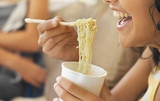
Instant Noodles Were Invented In Response To Mass Starvation

1945 was a rough year for Japan, and if you don't know why, we can wait while you Google it. The country went from a powerful industrial empire to a smoking, radioactive ruin overnight, and suddenly their biggest problem was figuring out how to feed everyone.

An issue only slightly complicated by underwater lizard monsters fueled by atomic energy and hate.
By way of a weak apology, the USA donated a shitload of flour to Japan, figuring that the cheapest and easiest way for people to dig themselves out of famine was to start making bread. But that was a distinctly Western attitude -- the Japanese aren't exactly known for their bread. They didn't have the ability to manufacture it in great quantities, and your average Japanese citizen probably wouldn't even know what to do with a slice of rye if they had one.
Instead, they made noodles. But overturning an apocalypse with noodles presented its own problems -- they took time to make and to prepare. Inventor Momofuku Ando watched people lining up for hours in the bitter cold just for a hot bowl of noodles to put off death for another day, and he figured this problem could be solved if they had faster noodles. Dare he suggest, some form of ... instant noodles.

The ludicrously unhealthy sodium count was someone else's idea.
Ando didn't limit his aspirations to saving Japan -- he wanted to come up with something that could feed the world. And noodles were his answer. Chicken noodles in particular, because unlike beef or pork, there's no culture on Earth that prohibits eating chicken. Working with secondhand equipment in a shack in his backyard, Ando figured out a way to fry noodles in chicken broth and then dry them into blocks so that they could be preserved for long periods of time. Because of his drying method, they would spring back to life a minute or two after you poured hot water on them. Instant ramen was born.

If he wasn't cremated and buried in one of those cups, then civilization has officially failed.
The product took Japan by storm, soon spreading across the globe and making Ando a wealthy businessman. Instant noodles didn't exactly solve world hunger as Ando had hoped, but at the very least, they solved college student hunger. Which brings us to ...
Sauerkraut Was An Alternative To A Long, Horrible Death

During the Great Age of Exploration, crews of salty seamen would spend months, or even years, at a time on a ship with no land in sight. Not surprisingly, lots of people died, mostly due to the fact that food doesn't keep that long. After their supplies of fruit and vegetables were exhausted or rotten, sailors would resort to fishing, but fish are notoriously lacking in vegetable nutrients, so men would begin to succumb to scurvy -- a disease that caused ulcers, respiratory problems, rotting gums, and eventually, lots of corpses being turned over to Davy Jones' Locker.

This was our punishment for waiting hundreds of years to invent Dr. House.
Out of necessity, sailors began to experiment with different foods that could last a long time and ward off their horrid mouth-rotting fate. The cause of scurvy, it turned out, was a lack of vitamin C. But back in those days, vitamins hadn't been discovered yet, so deciding what kind of food would ward off death was pretty much a crapshoot. The eureka moment came in 1768, when Captain James Cook set off on the voyage in which he discovered Australia. His ship, the Endeavour, carried on board 7,860 pounds of a German delicacy known as sauerkraut.

Shown here looking as happy as anyone would be hanging around four tons of spoiled junk for years on end.
Sauerkraut is fermented cabbage -- spoilage isn't merely no big deal, it's required. So although the crew of the Endeavour quickly ran out of hot dogs to eat it with, supplies lasted the whole journey. And because it's rich in vitamin C, none of his crew came down with scurvy.
As is often the case, the West was "discovering" something that other parts of the world had known for thousands of years. For instance, South Koreans eat fermented cabbage (kimchi) with almost every meal, and it came about for the same reason: Centuries ago, someone found that the dish could be stored indefinitely and provide Vitamin C over the course of a long winter.

Picky children could sit at the table until they've cleaned their plate for months on end and still stay healthy as ever.
Once upon a time, you could even get a kimchi burger at a Korean McDonalds ...

... so you could get your daily dose of Vitamin C while thinking about your mother's tits.
Blair is on Twitter. Matthew Moffitt is a part-time novelist and comedy writer whose first novel will be published in November by EDGE science fiction and fantasy. He is also on Twitter. Special thanks to his wife for helping him on this article.
Are you still hungry? We apologize for that. To help you lose that appetite, you should check out 5 Horrifying Food Additives You've Probably Eaten Today and The 6 Creepiest Lies The Food Industry Is Feeding You.
Subscribe to our YouTube channel to see why a diet of water and grass probably is best in 6 Ways The Food Industry Tricks You Into Eating Garbage, and watch other videos you won't see on the site!
Also follow us on Facebook, so we can stalk through your photo albums.
It's Labor Day, which everyone knows is the best time to buy as many T-shirts as possible. We can help you with that AND save you money while you're doing it! Head over to the Cracked Dispensary and use the promo code LAZYLABORDAY to start looking rico suave today.
