21 Early Logos That Were Taken Out Back And Retired
In 2010, Burger King caused a major outcry when it introduced its new logo. The new logo was accused of being too "sexual" and suggestive, with many people saying it looked like the king was performing a lewd act. Burger King was forced to abandon the logo after just a few months.
In 2011, Abercrombie & Fitch came under fire for its new logo, which featured a half-naked man with his back to the camera. The company said the logo was meant to be "aspirational" and "attractive," but many found it to be offensive and sexist. Abercrombie eventually scrapped the logo and went back to its old one.
A recognizable, impactful logo is a central part of any successful business. It's the reason those same businesses pay enough money to lift multiple families out of poverty for a team of graphic designers to make them a really cool shape. However, logos weren't always so slick and shiny. In fact, logos specifically seem to have a propensity to age like milk in the cushions of a baby's car seat. Check out these 21 logos that are the “awkward braces photos” of some of the world's most successful corporations.

Source: BoredPanda
Nickelodeon

Source: Cracked

Source: Cracked

Source: BoredPanda

Source: BoredPanda

Source: BoredPanda

Source: BoredPanda

Source: BoredPanda

Source: Cracked

Source: Cracked

Source: BoredPanda

Source: Cracked

Source: BoredPanda

Source: BoredPanda

Source: BoredPanda

Source: BoredPanda

Source: BoredPanda

Source: BoredPanda
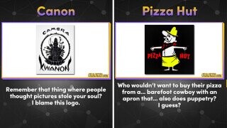
Pizza Hut

Source: Cracked

Source: BoredPanda

Source: Cracked
