The Internet Has Been Hardcore Dunking on Warner Bros. Discovery's New Name and Logo
On today's installment of “graphic design is my passion,” it seems AT&T's brand new spinoff company, WarnerMedia-Discovery, apparently gives absolutely zero shits about its public image, debuting their very, erm, minimalistic, new name and "initial wordmark” logo to the delight of approximately no one – except maybe for the guy who invented Microsoft Word's WordArt function.
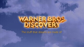
In a Tuesday morning town hall with WarnerMedia employees, Discovery Communications CEO, David Zaslav did his best to hype up the new company's name and logo – which had both previously been owned by telecom/media conglomerate AT&T before being merged and shot off to fend for themselves as a stand-alone corporation. “Warner Bros. Discovery will aspire to be the most innovative, exciting and fun place to tell stories in the world – that is what the company will be about,” the exec explained in a statement. “We love the new company’s name because it represents the combination of Warner Bros.’ fabled hundred year legacy of creative, authentic storytelling and taking bold risks to bring the most amazing stories to life, with Discovery’s global brand that has always stood brightly for integrity, innovation and inspiration.”
Don't Miss
Despite this well-worded statement, it seems the company's first “bold risk” was to design a logo – albeit, a preliminary one – so despised, it almost singlehandedly united the entirety of Twitter in dunking on its evidently half-assed existence , with fans lambasting its design …
… noting its apparent inspiration from Windows 95 …
… questioning why the company didn't opt for the much more amusing name of WarBroDisco …
… and even accusing the company of plagiarizing a beloved children's movie …
… and designing a logo with the specific intention of pissing people off. No publicity is bad publicity, folks!
Speaking of logo-related bad publicity, this is far from the first time Warner Bros, has found itself in the hot seat surrounding a questionable design. Earlier this year, the company unveiled its new animated title sequence, a controversial move garnering a significant amount of flack from Twitter users everywhere.
So folks, although the company doesn't technically exist yet, with all the drama surrounding its new name and logo, it feels like it's been around for years – much like the strange quality of its new images.
For more internet nonsense, follow Carly on Instagram @HuntressThompson_ on TikTok as @HuntressThompson_, and on Twitter @TennesAnyone.
