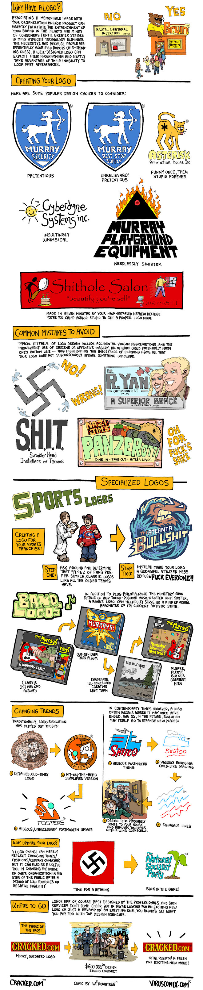
Awful Logo Design: An Art Form [COMIC]

Check out past updates, in which Winston showed you The Lifespan of Every TV Show Ever, The Evolution of Fictional Characters by Medium and Words That Need to Be Invented [COMIC].

Check out past updates, in which Winston showed you The Lifespan of Every TV Show Ever, The Evolution of Fictional Characters by Medium and Words That Need to Be Invented [COMIC].
293 Comments
hah, love the illuminati one
ReplyAwesome work as usual, Rowland
Replyclip art and papyrus...
ReplyALL OF MY FIERY RAGE
I've just started reading these. Really enjoying them
Replyvery good, and consistantly hilarious, the bit about the logos getting shitter until the design team gouge your eyes out bahahahahahaha
ReplyThe Band Logo reminded me of the first 4 LedZep Albums. except in that the LedZep ones are each better than the last.
ReplyThe new nazi logo looks just like the rebranded campaign logo of the UK conservative party.
Reply Hide All See All 3 RepliesExactly. :)
Har Har. Conservatives are Nazis. It never gets old!
MJ comprehension fail
The sports team logo is right on.
Replylove the bit about sports logos
ReplyLoved it. Realizing this stuff was a big part of the reason I abandoned my graphic design degree.
ReplyMore clients for me.
Hehe, the R. Yan logo reminds me a lot of when I was using braces - my dentist only used steel imported from Germany to make braces.
ReplyBy the way, the National Socialist Party right next to a picture of a plant? I see what you did there.
The needlessly sinister logo looks a LOT like the logo used by the company from where I buy all my beading supplies, Fire Mountain Gems.
ReplyFire Mountain Gems is located in my hometown, so I noticed the exact same thing.
I think the funniest one is the one where the nazi flag is being rebranded as the new "green" nazi party. This is because I know a bunch of companies from Wal-mart to BP that are jumping on the same green bandwagon. Their going green may only be switching brands of toilet paper and recoloring their logo green with a plant symbol.
Reply Hide All See All 4 Repliesagree! that's the funniest
Totally agree... That new logo made me laugh hard.
I think it's a parody on the UK Conservative Party, actually.
Why all the conservative hate?
The postmodern thing is so true.
ReplyA good comic... for once
ReplyWell, this is first, but I suppose a triple-post could happ-
A good comic... for once
ReplySo... A good comic, for fourth?
OMGWTF WE GET IT. YOU ARE CLEARLY DOING THIS ON PURPOSE.
A good comic... for once
ReplyOh, that's interesting.
A good comic... for once
ReplyOK, sometimes double posts happen.
That last picture is all wrong! Everybody's wearing pants!
Replydamn you guys are good
Reply