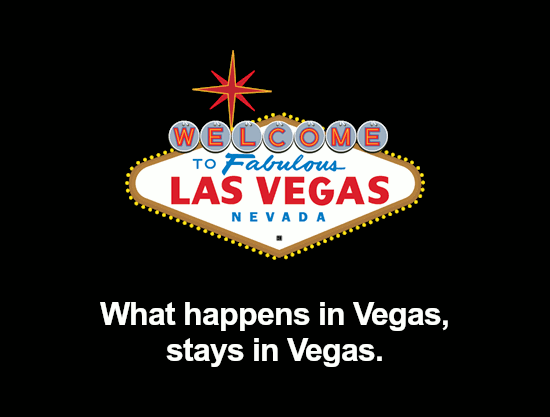
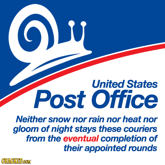
18 Famous Logos, Redesigned To Actually Make Sense
We asked ourselves, 'what if logos were actually meaningful?'

Cracked pays people to make smart memes. Visit the Photoplasty and Pictofacts Workshop to get in on it.
Companies and organizations spend a distended rectumload of cash on their logos and slogans, and yet still seem to wind up with incomprehensible garbage. And even when a company blows another million bucks to rebalance its logo's energy fields, they still wind up with useless crap. So we asked our readers to come up with some more appropriate versions of famous company and agency logos.
(Please note that some of these are animated, so if you don't see what's changed, give it a sec.)