5 Official Websites You Won't Believe Are This Bad
Plenty of terrible-looking websites exist. Generally, though, those websites are designed by and for idiots, so most of us will never have to come across them.
Every once in a while, however, a website for a famous, successful actor (or popular film, or service), will show up, and even though the subject is worth lots of money and has a whole team of people to worry about its image, the website is shockingly terrible. Like, '90s terrible.
When that happens, I will always be there.
"Hi, It's Me, Actor Bryan Cranston!"

Bryan Cranston (Walt from Breaking Bad, Hal from Malcolm in the Middle), is probably the greatest actor on television right now (he's certainly my favorite). He won three straight Emmy awards for his work on Breaking Bad, was nominated for three for Malcolm and has over 100 acting credits to his name. He's equally competent in drama and comedy and, if you've ever seen him on Celebrity Poker Showdown you'd have to agree that he just seems like a genuinely fun guy to hang out with.
And of all of the infinite combinations of graphics, text and code available in the world, there is only one that seems to scream (helpfully and politely), "Hello! My name is Bryan and I am an actor on your television; thanks for looking at my website!"

I don't even think this is a terrible website. I first saw it linked on Patrick Cassels' blog, and he described it as "adorably uncool," which is absolutely the best label for this site. It's neatly organized, the fonts are unspectacular and none of these things are bad; they're just silly, and totally endearing. It's like he's channeling his character from Malcolm in the Middle. A well-meaning but slightly behind-the-times working man made this website to say, "Hi and thumbs up!" to all his friends. This is the website that everyone's dad would make.

It's just all so damn goofy and cute. Almost everything about this site is designed to be helpful and comforting, just so no one gets confused ("You need Quicktime to view this clip. It's free. Click this link to get it!"), and even his bio has a classic Dad-Joke vibe.

I worry about anyone unfamiliar with Bryan Cranston's work finding this site and thinking. "Gee, what a sweet and wacky guy this fella is! I can't wait to check out this Breaking Bad show for more of his silly antics!"

The Highlight:

You're the best actor on television and I really want to meet you someday.
Yale School of Art? More Like Fail School of Fart! More Like OH CRAP MY EYES!

Unlike Walter White's Fantastical Playground of Colors, the official website for the Yale School of Art doesn't get a pass from me, because it has none of the lovable earnestness of Cranston's site.

It's bright, cluttered, the colors clash and most of the important information (for example, the address of the school), are almost impossible to read. It looks like a late '90s Angelfire site and one of the Muppet Babies had a child and then let a Highlighter pee on it. It feels like your nephew's first website, except it's an official website for Yale University's art school. Yale University!

Maybe I shouldn't include this one, because it's related to art, and having any association with art is unfortunate shorthand for "I can do whatever I want and it doesn't have to make sense." According to the About page, the site is constantly changing because "every graduate student, staff person and faculty member of the School can change this website's content or add to it at any time." It's like an ongoing art project that college kids can screw with, which might explain the distinct "screwed with by college students" vibe of the site. I should have let this site slide because of that simple fact, but for some reason I wasn't thinking clearly when I read the About page.

Oh, right. The background is an image of a TMNT pizza repeated, forever.
Whenever I try to remind myself "It's just artists being artists; let them do their thing," I look up at the address and remember that it contains "yale.edu," and I lose all sympathy. The address to the website I work for contains the word "Crack," but even I wouldn't let that kind of shoddy design work fly, because I don't want to embarrass myself in case my fourth-grade art teacher is reading this.

You're Yale for Christ's sake!
The Highlight:
This gif, repeated to infinity, is the background to the "Recent Changes" page:

I know exactly how you feel, Miserable Lady and Disembodied Hand.
If You're Feeling Depressed, Please Call, and Don't Ever Visit, the Suicide Hotline

This will be a short entry, because even though we're dealing with the website specifically, we're still dancing around the topic of suicide, and there's really nothing funny about that. Suicide is serious, and dangerous, and scary, and if you're even contemplating it, I have two bits of advice: 1) talk to someone who loves you; and 2) visit absolutely any website that isn't suicidehotlines.com, because that CANNOT be the last site you see.

I was shocked by how bad this website was. It's everything. The strange, "black-on-black with a dark blue outer glow" color scheme, the starry background, the fact that, depending on your monitor's resolution, the page might just stop abruptly in the middle of your screen ...

... or the depressing, hand-drawn illustration of a woman crying alone, underscored by a doofy-looking clip art phone ...

... just everything. Everything about this site makes it clear that it was designed in 1994 and then never looked at again by anyone associated with the actual Suicide Hotline. And again, this is a great service, and the Crisis Counselors who work there are kind, supportive, brave heroes. They just can't make a website for shit.
The Highlight:

"Hi, Suicide Hotline? No, I'm not depressed; I'm trying to get a hold of your designer. He's the one you should really be worried about."
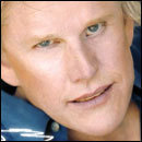
I Need to Lighten the Mood, So Here's Gary Busey Trying to Fuck You

This site can be whatever it wants to be, because Gary Busey is legitimately full-on crazy. And it's actually nowhere near as crazy as I expected it to be. It's a surprisingly appropriate destination for Gary Busey: Sex Magician.

It's like an ad for a new-age religion that promotes Gary-Busey-fucking-induced enlightenment. Nothing else in his whole site tops that amazing header picture. Sure, it's interesting that, on his homepage, he added only three pictures to represent himself and these are the ones he picked:

... but that's nothing compared to the softly lit, wind-through-hair, "I'm-clearly-the-kind-of-guy-with-ceiling-mirrors-over-his-bed" portrait of seduction up top. It's just so powerful, in an I-Think-Someone-Sanded-Your-Eyebrows-Off sort of way.
The Highlight:

Of course.
Holy SHIT, Space Jam!

It's gonna get pretty real here for a second.
When I was in 8th grade, I made three Geocities websites. Two of them just featured my commentary and predictions concerning various storylines happening in the World Wrestling Federation, and one of them was for the short-lived pop-punk band (Dizzy Cubed) that I formed when I was 14 years-old. The sites were obnoxiously bright, full of gifs and generally offensive to all senses. I got into some pretty weird font territory on one of those wrestling news sites, and the only pieces of content on my band's website were a scanned picture of my bass guitar, and a black-and-white picture of the guys from Blink 182 wearing doctored "We Heart Dizzy Cubed" t-shirts that I'd crudely rendered in MS Paint. They were three of the worst websites of the mid '90s, when every website was the worst website.

Well, someone saw those three websites (before they were taken off the Internet), and crafted their entire graphic design style based on the lessons contained therein. This person learned everything they know about aesthetics and website functionality from three websites ("DizzyCubedRocks," "WWFRawIsDaniel" and "WrestleFarts").
And then that person was hired to make the website for the major motion picture Space Jam.

A lot of the fun/horror here comes from clicking around and really exploring the official online home of expensive hit blockbuster, Space Jam (starring Michael Jordan). You have a lot of options: games, souvenirs, a jump station, jam central, planet b-ball, a- wait, hold on, a jump station? Junior Jam? What the hell do any of these things even mean?

So explore! Go nuts! For example, go to Junior Jams, where you can learn basketball tips, but also "meet the characters," plus there's a coloring book, and also a section on "neat stuff to look at." Does that clear up why this section was called "Junior Jams"? No? Oh, well, let's just not worry about labels. Let's really dig into this. Here is a screen-grab from Junior Jams:

And for comparison, here's a screengrab from a site that was created specifically to highlight every mistake that new designers make when creating websites. It's called The World's Worst Website.

I could dwell on how eerily similar they are, but then I wouldn't have time to show you the "Jump Station"!

"Where should we put these links?"
"What? Just put it with the other links."
"Oh, OK. OK. Is that- Are those in the 'Shuttle' or 'Moon ... face'? Is that one of our sub-pages?"
"They're in the Jump Station, Jesus. It's all pretty straightforward."
The Highlight:
If you search around long enough, you'll come across a section called "Shooting Hoops." It's buried in an image in the "Planet B-Ball" section (obviously). I clicked on it, thinking there might be some kind of basketball-shooting flash game.

Will do!
Special thanks to Robert Brockway and Lindsey "Percules" Percle for additional research.
Daniel O'Brien is Cracked.com's Senior Writer (ladies), and he is growing a hideous mustache on his face all month long to fight cancer. Donate to his face right here (everyone). Or donate to Cracked writer Soren Bowie's face right here, or donate to Team Tiger Awesome's Nick Mundy's face right here, or anyone on the Cracked.com Cancer-Fighting Attack Squad right here
For more from Daniel O'Brien, check out Dan O'Brien Reviews Roseanne Barr's Blog and White People Love Kanye West.
Have a funny idea for a T-shirt? Enter our contest for a chance to see your brilliance plastered on hipsters the world over. (And we'll toss you 50 bones if you win.)
