4 Famous Movie Logos That Were Almost Terrible

Truly great movies have instantly memorable logos. Think about it, wouldn't Titanic be even more iconic if the poster boasted Leonardo DiCaprio punching the iceberg in the face? While there are certain logos everyone recognizes, the stories behind them aren't generally told. And unlike the nauseating discovery of where you came from, where these logos originated is actually pretty dang interesting. Such as how ...
The Star Wars Logo Was Designed To Look "Fascist" (And Its Creator Wasn't Credited)
It's hard to imagine Star Wars without its logo, that familiar lettering so iconic that it's appeared on everything from toys to T-shirts to bags of fruit -- because apparently some of us need a tangential association with robots and space wizards in order to choke back vital nutrients.
But even when the movie was done shooting, the filmmakers still had no idea what the logo would look like. Early designs were kind of boring, and made Luke Skywalker look like a sword-wielding David Bowie impersonator. Plus the title was still "The" Star Wars at that point:

Even when hocking the movie at the 1976 Comic-Con, promotional materials featured variations on this design ... which not many people seemed to give a crap about anyway.

After rejecting several other ideas ...


... Lucas asked 22-year-old Suzy Rice, a recent hire at an LA ad agency, to come up with a new logo to use in a brochure for theater owners. Lucas' only direction? Make it "very fascist" -- you know, for the kids. At the time, Rice was reading a book about German fonts, and she decided the best way to heed Lucas' advice was to work with some kind of Nazi font. After settling on Helvetica Black, which evolved from the fonts used in Nazi propaganda, Rice came up with this:

While Helvetica Black isn't intrinsically Nazi-like (it doesn't have little arms doing sieg heils coming out of every letter or something), somehow Lucas' weird-ass advice inspired Rice to create perhaps the greatest movie logo of all time. All that was left to do was flatten out the "W," which some people attribute to Lucasfilm's Joe Johnston, while Marvel comics letterer Jim Novak claims he made the change for the first issue of their nutty adaptation and was paid a measly 25 bucks for it.

As for Rice, because she was only a contractor, she was told that she wouldn't receive any credit, as the end titles had already been completed -- even after they decided to use her design for the film's opening titles. It's too bad the director wasn't the type to continually go back and modify elements of his own movie; otherwise the woman who came up with the most recognizable title in film history might have received more than bupkis for her work.
The Ghostbusters Logo Only Became Famous Because Of A Legal Screw-Up
The Ghostbusters logo was everywhere in the 1980s. How many movie logos were popular enough to sell their souls by making personal appearances in Diet Coke commercials? Though in retrospect, showing your product being hastily consumed by an unwanted phantasm seems like kind of a weird marketing strategy.
It's difficult to imagine someone actually inventing something that's now so cemented in popular culture. It's almost easier to imagine the logo being paradoxically sent back in back in time by the CEO of Hot Topic. But it was created, by Michael Gross, who got his start as the art director for National Lampoon, the landmark humor magazine and/or perpetrator of Van Wilder films.
After his work with the Lampoon, Gross journeyed to Hollywood, where he connected with Ivan Reitman and landed a job in the art department for Ghostbusters. Gross and his team worked to create a logo for the Ghostbusters purely as a function of the story, with no intention of using it for marketing purposes. While the script describes a team logo, it didn't provide much detail, so the art department tried out a number of concepts, most of which would look like crap on a carton of Ecto Cooler.

One bizarre idea found the text handcuffed to a disembodied hand, which could have worked well for Star Wars.

But again, this was going to be a relatively small logo you'd only see on the costumes, outside the fire station, and on the side of the Ecto-1. So the art department "didn't think twice about it," because they had a buttload of other stuff to design. But when it came time to release the movie's first teaser poster, there was a problem. The studio, Columbia, hadn't obtained the rights to the title Ghostbusters, which was still owned by a short-lived 1970s children's show, nowadays best remembered for ruining the Saturday mornings of every 1980s kid who didn't read their TV Guide closely enough. (Younger readers: TV Guide was a tiny magazine you had to buy so you knew what was playing on TV. The past was awful.)
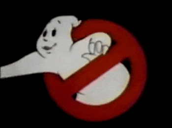
Because of this legal snafu, Columbia desperately needed a way to advertise a movie without using its title. The solution ended up being slapping Gross' final logo on the poster.

Despite the fact that this was purely concocted to avoid a lawsuit, the Ghostbusters poster seemingly influenced the way blockbuster teaser posters were made from then on: big logo, no title. Everyone's done it since then, from Batman to Spider-Man to The Incredibles to Samuel L. Jackson shouting about snakes.
Ironically, this did lead to Columbia being sued -- not by the aging character actors in an ape-driven jalopy, but by Harvey Comics. Possibly because the logo wasn't originally supposed to be a centerpiece of the film's advertising, no one on the crew seemed to care that the ghost character looked quite similar to Fatso, the rotund spook from Casper The Friendly Ghost.

So Casper's publisher filed a $52 million lawsuit. Harvey Comics ended up losing the suit after the court discovered that they whiffed on the copyright renewal, landing Fatso in the public domain and Ghostbusters free to use their own now-famous obese specter going forward.
There Were A Ton Of Great Unused Logos For The Shining Because Kubrick Didn't Like Anything
One of the scariest movies of all time, The Shining also boasts one of the scariest posters of all time -- a haunted face trapped inside the letter T, like something out of a demonic Sesame Street segment.

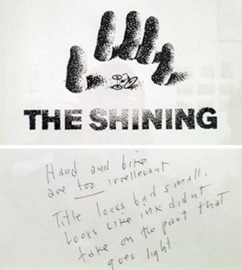
The poster was created by the legendary Saul Bass, best known for his stylish posters and groundbreaking title sequences, such as for Vertigo and Psycho. He also designed the AT&T logo and directed a certifiably insane movie about murderous ants. The man was a goddamn genius. So it's not surprising that Bass came up with more than one brilliant idea for the Shining poster, but each one was met with a dickish comment from Stanley Kubrick, which ... well, is also not surprising.
The unused concept sketches were recently displayed at an exhibit which featured Kubrick props, costumes, and other filmmaking materials (sadly, the cranky pants he seemingly wore at all times were not included). This image Kubrick called "too irrelevant," and he thought the title looked "bad."
This one looked too much like a "science fiction film," somehow.

He also complained that two ideas put "too much emphasis on maze," which is a weird thing to say given that that's literally where the climax of the movie takes place.


Further proving that Kubrick didn't beat around the hedge maze when it came to criticism, this note simply begins "don't like art work."

All Of The Jurassic Park Logo's Rough Drafts Were Laughably Bad
In the Ghostbusters tradition, the first Jurassic Park poster simply featured the logo -- no actors, or dinosaurs, not even an artist's rendering of Jeff Goldblum lying shirtless in repose.

But one doesn't just effortlessly come up with timeless cinematic iconography. The Jurassic Park team went through a crap-ton of ridiculous ideas first. It goes beyond the godawful poster that went full Lion King. There was a slew of designs that looked as if the park went ahead and hired SeaWorld's guy.
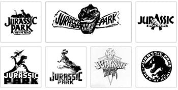

The movie ended up pulling from the original book, which featured the familiar T-Rex skeleton silhouette. Now that they had a central image, they still needed a font. One of the title treatments was in a font called "Neuland," which has been called the "'black face' of fonts." Why? As pointed out in TIFF's extensive history of the Jurassic Park logo, in 1930s America, Neuland was used by designers to convey "primitive" on African music records, "safari adventure" books, and American Spirit cigarette packs.
In reviving the font, Jurassic Park conjured themes of colonialism and the primitive "other." This could be written off as an in-universe example of one of the park's many terrible decisions, but most problematically, the movie's success helped popularize the font again. Neuland showed up in '90s properties such as the Lion King musical and Cool Runnings.

Still, despite its typeface's troublesome origins, the Jurassic Park franchise has stuck to roughly the same logo for each sequel -- though now it's made of stone, broken, and on fire, presumably as a metaphor for the brains of people who are somehow still racist in current year.
You (yes, you) should follow JM onTwitter, or check out the podcast Rewatchability.
Support your favorite Cracked writers with a visit to our Contribution Page. Please and thank you.
For more, check out The Secret 'Fuck You' Before Every Modern Film and How Marvel Tricked You Into Seeing ' Guardians Of The Galaxy'.
May we interest you in following us on Facebook?
