7 Mind-Blowing Easter Eggs Hidden in Famous Publications
Previously we informed you about some of the most mind-blowing Easter eggs hidden in music albums, classic works of art, and movies and TV shows. Hell, we've done video games not just once, not twice, but three times. So it was only a matter of time before we turned our attention to the most diabolical industry of all -- the publishing industry. What other industry can claim to have smuggled product for both God and Hitler? These slingers of brain candy have been corrupting humanity for longer than the gun and oil industries combined, so it's not surprising that they've stashed a few bizarre secrets up their sleeves. For instance ...
The Mysteries on The Da Vinci Code's Cover Are Cooler Than the Ones in the Story

Long before it was spawning some of the most mysterious hairdos in Tom Hanks' career, The Da Vinci Code became a literary phenomenon by giving history professors chest pain. Real historians were probably glad for the increased interest in the Bible as a historical document, and might even approve of Dan Brown's general depiction of history as a rich tapestry of mysteries, but they probably weren't quite as thrilled with Brown's promise that those mysteries have clear-cut right and wrong answers, discoverable by anyone resourceful enough to solve a USA Today crossword puzzle. While the mysteries that his protagonist encounters during the course of the book might be a little obvious, the cryptograms and word puzzles didn't stop inside the pages of The Da Vinci Code. In fact, Brown saved his most intriguing mysteries for the dust jacket.

If you stare long enough, it becomes an image of Dan Brown spanking it to a copy of Cryptonomicon.
Years before the publication of The Da Vinci Code, fans of Brown's novel Deception Point might have noticed a seemingly random series of numbers and letters on the last page of that book: "1-V-116-44-11-89-44-46-L-51-130-19-118-L-32-118-116-130-28-116-32-44-133-U-130."
While sane readers probably assumed that a mouse got stuck in the gears of whatever giant printing press spits out Simon & Schuster paperbacks, crazier fans may have checked to see what would happen if you replaced each number in the sequence with the first letter in the corresponding chapter in Deception Point. If you did that, you would have discovered the letter sequence "T V C I R H I O L F E N D L A D C E S C A I W U E" -- which you might recognize as also complete gibberish. But Brown's crazy fans didn't decorate their sheds with newspaper clippings and jars of urine because they're quitters. Those fans would have noticed that there are 25 letters, which is a square-able number, and realized that when you arrange those letters in a five-by-five square, you get:
T V C I R
H I O L F
E N D L A
D C E S C
A I W U E
... which, when read from top to bottom by column (instead of left to right by row like you just did), reveals the message: "THE DA VINCI CODE WILL SURFACE."
Of course, this being two years before the phrase "Da Vinci Code" meant a goddamn thing to anyone, they would have been just as likely to wonder who Dav Incico was and how exactly he was mixed up in the sinister sounding Dew-Ill Surface. Which makes it all the more impressive that Brown got away with crazying up the last page of his book two years before it meant anything.
When The Da Vinci Code finally did surface as promised, the book's dust jacket was riddled with crazy cyphers.

"The Greek letter delta gets its shape from a hand raising the middle finger. I think the meaning here is obvious."
That trail of clues led to two numbers written in light red ink on a dark red background on the back of the book, which, if you were somehow able to find them ...

*snicker* "No, no, I swear the text is there, just keep looking for it!"
... and plugged them into Google Maps, would reveal themselves to be the latitude and longitude of Kryptos, the sculpture outside the CIA headquarters. If you solved Kryptos, then you would find yourself in a dark room being interrogated by the CIA, because none of their code breakers have been able to solve it in the 23 years since it was put there.

Because fuck you, that's why.
Actually, the Krytpos reference would turn out to be a nod to the Washington, DC-based mystery that would anchor Brown's next novel, The Lost Symbol. When The Da Vinci Code became a huge hit, the publisher created a promotional game around the clues, and presumably laughed nervously while waiting to meet the lunatic who would be crazy enough to solve the damn thing.
While the sponsorship tie-in might make the whole thing seem like a capitalist hoax set up to sell books, it's at least a little impressive that Brown saved his most difficult and intriguing mysteries for his audience, and that he was doing it before he had any reason to believe that anyone would give a shit about any of it.
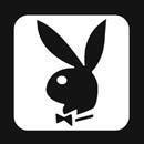
Playboy Magazine Has a Bunny on Every Cover

By definition, Easter eggs require the artist to put more attention into tiny details than the people consuming it can be reasonably expected to notice. If that is in fact the definition of an Easter egg, Playboy magazine might be responsible for the greatest Easter egg of all. After all, movie directors and video game makers can be pretty certain that anything they hide in their work will be hunted down by attentive fans and posted on a website for everyone to see. The only thing Playboy can assume about its audience is that they're going to be doing or at least thinking about doing things that could get them arrested if done in public. Their fan base is less devoted and frenzied, more horny and then looking to get rid of the evidence.
This makes it all the more baffling that Playboy has been hiding cleverly crafted Easter eggs on the covers of its magazines all this time. Specifically, Hugh Hefner and company have been hiding the bunny logo on every single cover, starting with the second-ever Playboy magazine that hit shelves in 1953. We're not sure we can call Playboy covers art, but we are pretty sure that might be the most unnecessary attention to detail ever included in the history of anything ever.
The cover below has the bunny incognito on the ribbon on the young woman's chest.

It took a team of young men nearly eight hours to position it on her breasts.
On this cover, the bunny ears are visible on the shoe at the bottom.

This one has the bunny ears on the film in front of her.

Zoom it in enough, and it displays an old issue of Hustler.
On this cover, the bunny ears take the shape of the flower the woman is holding.

The flower, lacking a mouth, silently begs for death.
This one has the bunny ears hidden on the fork.

Here it is as a white splotch on the white sheets underneath the left boob of 1994 Playmate of the Year Jenny McCarthy.

Of course, this was before she found out that silk sheets cause autism.
There's almost a sad fatalism to that last one. Hefner took the time to hide the bunny head right next to something that would ensure that nobody noticed it, and made the bunny head look like the sort of stain that serves as an exclamation point marking the end of his audience's interest in the product he makes. That might sound pretty sad on the inside for someone who has that many wives, but we're pretty sure "hasn't changed out of his pajamas for over a decade" is a sign of serious depression.
Autocar Magazine -- James May Sends a Message to the Readers

Staying in the realm of contradictions, up next we have an editor putting an incredible amount of planning into hiding a message that he apparently wrote while drunk (and 10 years old). Fans of the BBC's Top Gear might know James May as one of the three guest hosts of the quirky show. He's also an award-winning journalist and a stunt driver. But back in 1992, he was just a lowly editor for Autocar magazine, and wasn't the least bit happy about that fact. Standard protocol would have suggested that he put his head down, kiss a few asses, and wait for his shot at a job in the magazine industry that he didn't actively hate. That's how you keep your job, and it's not like the magazine industry was going anywhere.
Like the show he would go on to host, May wasn't a huge fan of standard protocol. So when he was given the opportunity to put out the magazine's special Road Test Yearbook issue -- which is apparently the Autocar equivalent of the Sports Illustrated swimsuit issue -- he did not take this as an opportunity to show off the ol' work ethic, and instead saw it as a chance to do this:

The editors' suspicions were raised when May tried to turn in an entry starting with a drop cap apostrophe.
With punctuation added, that reads: "So you think it's really good, yeah? You should try making the bloody thing up; it's a real pain in the arse." May was in charge of putting the whole supplement together, which took several months and was "incredibly boring." So he looked over his shoulder a couple times, snickered to himself, and went about the painstaking process of re-editing the first sentence of each paragraph to hide a secret message that reads as though it was written in 15 seconds.
Instead of moving up to the big leagues of Autocar magazine, May was promptly fired, which is probably for the better, since magazine editors are typically expected to write more carefully than that and not find the job of putting a magazine together "incredibly boring." May went on to a career test driving incredibly fast cars on Britain's Top Gear, co-hosting shows about drinking, and being told "well done" and "Good show, old chap" by everyone in England.

He budgets at least two hours a day for monocle adjustment.
The Last Illustration in A Series of Unfortunate Events Has a Hint to the Next One

A Series of Unfortunate Events is a series of novellas by Daniel Handler, writing as the fictional character Lemony Snicket. There are an unlucky 13 books in total, each one following the lives of three children whose parents are killed in a house fire and who are adopted by their old, greedy distant cousin who is looking to get at their fortune one way or another. In the first book, he tries to marry one of the little girls. The novels are apparently not ironically unfortunate.
As you might have picked up from the dark tone, Handler was an aspiring adult novelist when his publisher convinced him to write the novels for kids, and he packed the books with tons of allusions and details that would require a literary degree to get. Whether he was doing it intentionally or out of boredom, it made for a series of books that fans agree are best experienced once as children and a second time once you've read all the grown-up books required to get the jokes. But even adult fans probably missed the clues hiding in the illustration by Brett Helquist at the end of each book.
For instance, here's the illustration that was waiting at the end of the first book.

And just like that, a generation of children became deathly afraid of lampposts.
The presence of the snake might have seemed like a confusing non sequitur to the millions of children reading the books as they came out, until they learned that the next book in the series would be titled The Reptile Room. Similarly, they couldn't have known why the final illustration in The Wide Window contains an optician's sign until they read The Miserable Mill, where the children encounter Dr. Orwell, an optician who lives in an eye-shaped house.

So ... he lives in a ball. No need to church it up, the man lives in a ball.
In this way, each book's illustration hints at the events of the next book, while also suggesting the value of repeated readings and the intended twice-over the books were supposed to get. It's like Handler was hiding the playbook for how to enjoy his work in each illustration. That, or again, just really, crazy bored.
One of the Most Popular Cartoons Ever Is a Coded "Up Yours" to Castro

Antonio Prohias was the most popular and influential political cartoonist in Cuba in the years and days before Fidel Castro took over. As one of the most annoying bugs up Castro's ass, Prohias found himself accused of working with the CIA. This of course meant that it was only a matter of time before the state police decided to pull him in for one of those interrogation sessions that never end. Prohias won that particular round of cat and mouse, managing to escape to America just as Castro was culling the Cuban media of its last scraps of free speech.

Prohias out.
Around the same time, Mad Magazine began publishing Spy vs. Spy, the only wordless comic in its pages. On the surface, it seemed like a riff on Tom and Jerry cartoons, with two characters whose full-time jobs seemed to be trying to kill the other in increasingly creative ways. But as the comic continued to appear and gain popularity, a deeper level of commentary revealed itself that suggested the Cold War battle being waged by covert military forces like the CIA, the KGB, and Castro himself. The comic appeared to mock these spies, who would seemingly stop at nothing to destroy one another despite the fact that they were identical variations on the same model, just wearing slightly different jerseys.

"Hehe! Explosives are fun!"
Don't take our word for it, though. While the comic never had any words in it, the front page of one of the special issues devoted to Spy vs. Spy noted: "Their antics are almost as funny as the CIA's ... They are the only two spies we know who haven't the sense to come in out of the cold. But they have a ball -- mainly trying to outwit each other." Adding to the intrigue of the minimalist political commentary was the fact that the comics appeared to be unsigned. Or at least they were unsigned in the eyes of anyone who didn't know Morse code. Those who did would have realized that those dots and lines under the title were actually a byline: "By Prohias."
In Cuba, a thumb to the chin is code for "Fuck you, Castro."
Prohias would later explain that the black vs. white characters were inspired by his time in Cuba, where anyone who was not a vocal communist was dismissed as an infidel. He created the early chapters of the cat-and-mouse tale immediately after arriving in New York, after successfully planning his own version of Spy vs. Spy while escaping from Cuba. He went on to live the capitalist dream for decades in America off of money made by the strips, the whole time signing his work like a spy, just like Castro said he was.
As Prohias put it himself, "The sweetest revenge has been to turn Castro's accusation of me as a spy into a money-making venture."
The Lord of the Rings' Fake Languages Are More Complex Than the Real Ones You Know

Lord of the Rings novices might assume that the names of people and places that populate Middle-Earth are just fun little nonsense sounds, or that the markings on the inside of the rings and on the maps throughout the movies were just fun bits of nonsense, or upside down cursive.

If you read it backward, it plays "Revolution 9."
Hell, you could make it through all three of the novels thinking that the strange little scribbles on the title pages were just fun border designs, like the swirls around the edge of a fancy doily ...

Or the little guy playing a horn and riding a dolphin was ... oh that is nonsense?
Even die-hard Lord of the Rings fans who know that those are real, fully formed languages probably assume that they were invented for the novel. But according to J.R.R. Tolkien, the languages came first. The world and the stories that take place inside them were just vessels for him to explore the studio space with the fake words and curly-fry lettering he made up. If you've ever taken a foreign language class, you've probably listened to audio tapes on which actors teach you how to say "Where is the library?" and "Jenny went shopping for sponges today" in the most perfectly wooden French or Spanish accent possible. Well, Tolkien's novels are really just long, drawn-out versions of the Spanish voice actor overenunciating the question, "Donde esta la biblioteca?"
Tolkien was a linguist first and a novelist by accident. He invented 20 different languages over the course of his career, and Middle-Earth was just a fictional sandbox where he allowed those languages to play ball. He laid out the whole tangled, convoluted history behind the languages of Middle-Earth in books like The Silmarillion, which focused on fake verb conjugation instead of orcs, and therefore didn't sell quite as well as The Lord of the Rings. It's unknown as of yet whether Peter Jackson will adapt The Silmarillion into three movies or pack it into two.
Daisy Is Looking at a Naked Lady on the Cover of The Great Gatsby

It's one of the most recognizable book covers in Western literature. If you've taken a high school English class in the past 20 years, you're likely familiar with the floating noseless face that stares out from F. Scott Fitzgerald's classic. It captures the tone of melancholy among Gilded Age glamour that pervades the novel: the sad eyes of Daisy Buchanan, the empty eyes of Dr. T.J. Eckleburg peering out from the billboard near George Wilson's auto repair shop, the naked titties and naked ass of a naked lady being reflected out of the sexy eyes on the cover in a way that symbolizes that some hot lesbian sex might be about to go down. If we lost you on that last one, you're probably not alone. You can look at the cover of the novel a hundred times without noticing the naked lady swimming in the irises of the eyes.

This could also be the webcam feed from any teenage boy's laptop at around 11:30 p.m.
While you can find literary criticism picking apart just about every aspect of the cover and how it ties into the themes of the book, the naked ladies are typically ignored, or brushed aside as "two reclining nudes," as though every person's eyes have those laying around in there.
The now iconic illustration had humble beginnings. While Fitzgerald was still finalizing the manuscript, the publisher had the illustration commissioned by Francis Cudat, a small-time Hollywood designer who was paid $100 and never illustrated another book cover. Fitzgerald liked the painting so much that he claimed to have written it into the book, and literary critics have been arguing over which passages it inspired ever since. But he would later regret the enthusiasm. During Fitzgerald's summer-long European drunk with his friend Ernest Hemingway, both writers agreed that the cover art was terrible and that the illustration wasn't serious enough for the masterpiece it was hiding. It was almost like Fitzgerald had been brainwashed by some element of the art that was visible when you gazed at a full-resolution rendering deeply enough.
When Robert is not reading books or magazines, he is writing for Freakin' Awesome Network and ranting on Twitter.
For more awesome Easter eggs, check out 10 Mind-Blowing Easter Eggs Hidden in Famous Albums and 7 Insane Easter Eggs Hidden in Movies and TV Shows.
If you're pressed for time and just looking for a quick fix, then check out Why the Son on 'Homeland' Will Grow Up to Be a Terrorist.
And stop by LinkSTORM to discover the articles we've hid Brockway's mustache in.
Do you have an idea in mind that would make a great article? Then sign up RIGHT NOW and pitch your first article today! Do you possess expert skills in image creation and manipulation? Mediocre? Even rudimentary? Are you frightened by MS Paint and simply have a funny idea? You can create an infographic and you could be on the front page of Cracked.com tomorrow!
And don't forget to follow us on Facebook, Twitter, and Tumblr to get sexy, sexy jokes sent straight to your news feed. Are you on Google+? So are we!
