How the ‘Woody Allen Font’ Has Been Reclaimed
In case you haven’t noticed, Woody Allen sucks. It seems as though much of the world has turned their backs on the famous director/comedian/giant creep now that renewed attention is being paid to accusations that he sexually abused his daughter in 1992, which Allen has denied. Not to mention the laundry list of other gross behavior over the decades, such as writing, directing and starring in a movie all about how terrific it is to hook up with underage high school girls, as long as you do it in black and white with classic Gershwin music blasting.
While Allen still keeps churning out increasingly cringey movies showcasing increasingly unbearable pseudointellectuals, they barely even get theatrical releases anymore. Then there was the time his recent memoir was literally pulped by the publisher. Come to think of it, the only thing Allen has done in recent years that has genuinely been a cause for celebration was when he announced that he was probably going to stop making movies. Alas, even that brief moment of joy was ruined by a later statement walking back his earlier claim.
While he’s seemingly going to keep on making movies about the existential ennui of horny old men until the day he dies, in the pop-cultural war against Allen, at least one piece of significant territory has been reclaimed: the “Woody Allen font.”
Don't Miss
Although early Allen comedies, such as Bananas, boasted flashy, colorful opening credit sequences…
…he later used variations of the old-timey “Windsor” font in most of the films he directed, first hinted at with 1973’s Sleeper. The text is plain white on a black background, which is pretty much the movie credit equivalent of a piece of cold, unbuttered toast.
Allen’s credit style was eventually cemented in Annie Hall and, along with neuroses and jazz, has since become one of his famous signatures. It appears in almost all of his films, from Crimes and Misdemeanors to Midnight in Paris to his recent batch we’re not even 100 percent sure actually exist.
Supposedly Allen got the idea to use Windsor from legendary type designer Edward Benguiat, who passed away in 2020. Benguiat famously “hand-designed” the logotypes for the New York Times, Playboy and Sports Illustrated, among others — not to mention how he designed the font that was eventually used in Stranger Things and many a Stephen King paperback (which, incidentally, is literally called “Benguiat). Well, apparently, back in the 1970s, Benguiat frequented the same diner as Allen and, during a chat, recommended that the director use Windsor, a font that dates back to the early 20th century. Allen obviously took that advice to heart.
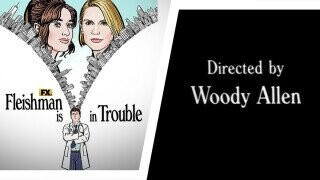
But now, that Woody Allen-ish typeface is being used in non-Woody Allen projects, in glorious defiance of the director’s prolonged stranglehold on this particular stylistic choice. For starters, there’s the new FX series Fleishman is in Trouble, starring Jesse Eisenberg as a divorced New York doctor.
While the show itself doesn’t use the font in its opening, the marketing for the show boasts a distinctly Woody Allen-ish typeface. This makes sense since it’s a drama about the marital turmoil of wealthy New Yorkers, featuring the former star of Allen’s To Rome With Love. Reviews have highlighted the “inescapable nouveau Woody Allen-ness” of the show and have speculated that “the font selection is an acknowledgment of Allen’s oeuvre as an ancestor of Fleishman.”

Then there’s last year’s dramedy Together Together, starring Ed Helms and Patti Harrison, which used the font for its opening credits and critics at the time noted was in and of itself an act of “subversion.” It’s true: The movie is a platonic story about a single, middle-aged man asking a younger woman to be the gestational surrogate for his baby, and it includes a scene in which Harrison’s character specifically criticizes Allen. According to director Nikole Beckwith, the scene (and presumably the title design) was inspired by her frustration with the familiar Allen narrative in which an “old decrepit, nebbishy guy who’s an asshole is going to get these beautiful young women who look to him for approval all the time on everything. And that’s not true.”
But no doubt the greatest revisionist use of the font was in the recent HBO docuseries Allen v. Farrow — yeah, the same show that the Los Angeles Times called the “nail in the coffin of Woody Allen’s legacy” used a typeface reminiscent of the famous font for its poster, creating an unsubtle graphic link between the horrific allegations against Allen and the artistic achievements that he arguably used to help deflect said allegations.

Hopefully, this means that more Woody Allen-appropriated elements will be wrestled away from the director and re-purposed for films that either subvert his themes or flat-out crap all over him. Watch out, clarinet music!
You (yes, you) should follow JM on Twitter (if it still exists by the time you’re reading this).
