9 Classic Movie Posters (With Bizarre First Drafts)
Designing a movie poster is no simple task. With a single image, you've got to convey the entire spirit of the movie and magically suck the dollars straight out of the uninterested ticket-buying public's pockets. Given the enduring designs that have graced the walls of our theaters for so long, you probably think poster designers have that shit down pat. But that's only because you haven't seen the posters we almost got ...
The Matrix: A Cheesy Hacker Movie
The Poster We Got:

Prior to The Matrix, hacker movies were usually cheesy B-flicks full of cringe-worthy technobabble and sad attempts to make computer nerds seem cool. So when Neo and gang arrived, the poster made it clear they were not fucking around: shades, guns, bondage gear. If you look closely, you can see that bullet shell casings litter the ground at their feet. Hell yes.
The Poster We Almost Got Instead:

It's like they found a way to make anti-piracy ads even lamer.
First of all, ignore everything for the moment and look at the tagline. "The future will not be user friendly." Oh, god, you can just hear what this movie's dialogue probably sounds like, all computing puns ("Download this, bitch!") and fake jargon uttered while hunched over glowing monitors ("They've fragmented the fiber mainframe! Reformat the ISP!").
Neo, meanwhile, looks like he's standing sullenly outside a gaudy nightclub because the bouncer won't let him in. Actually, that must be it, because that's a reflection -- he's not looking at a "The Matrix" sign at all. His sad widdle puppy eyes are actually focused on the entrance to the exclusive, blue-pill-takers-only nightclub, the assbackwardly named Xirtam Eht. We hear only the voltiest batteries go there.
Star Wars: Pornstar Leia Has Terrible Aim
The Poster We Got:

OK, so no one ever said you couldn't stretch the truth a bit in order to drum up interest in your obscure sci-fantasy flick. Luke also looks like he's spent about three years benching Ewoks, while Leia apparently spent that time on the business end of a plastic-surgical droid's scalpel. And sorry Episode VII, but Luke's got your crossguard lightsaber beat all to hell.
The Poster We Almost Got Instead:

"Star Wars! Space and shit! Whooo!"
This early concept took the movie's swashbuckling aspect to an in-your-face extreme, with two different versions. Luke is grasping Pornstar Leia right around what her mama gave her (or, more creepily, what his mama gave her) and copping his very best Blackbeard pose. Meanwhile, depending on the version, Stormtroopers are giving her an upskirt (left) or the Clueless Buccaneer Twins are leaving a pleading C-3PO behind (right), because fuck droids when there's ass at play.
Leia is also wantonly firing some kind of futuristic fireworks gun in Vader's general direction without even looking, but Vader is unfazed because bottle rockets are no way to fight a Sith Lord, silly princess.
Then we have this one:

"Star Wars? Reading and shit? Meh."
Somehow Leia has been inflated to even more porntastic proportions, yet we're expected to read a shit-pile of stupid words that no one will ever even realize are there, because boobs. Admit it: you didn't even notice that the ultra-memorable "A long time ago in a galaxy far, far away" was originally the much lamer "In the year 3000" until we just told you.
A Clockwork Orange: Mainframe Jesus
The Poster We Got:

This is it: the poster that adorned your bedroom wall during that awkward phase that caused your mother to question her suitability as a parent. Of course, you hadn't even watched the movie yet, because mommy wouldn't let you, but that didn't matter, because look how friggin' cool this poster is. The choice of a font that looks like something from Sesame Street is questionable, but that's more than made up for by the fact that half-mascara Malcolm McDowell is threatening to either ultra-violently murder you or pelt you with disembodied eyeballs.
The Poster We Almost Got Instead:

Stanley Kubrick's Terry Gilliam's A Clockwork Orange.
In this alternate cut, Alex is rehabilitated by having his head shoved into a TV and being crucified on a '70s mainframe, complete with a reel-to-reel tape system in which one of said reels mounts on his dong. And while that certainly sounds like something straight out of a Kubrick film, none of those things actually happens, at least as far as we know (our moms still haven't let us watch this movie yet).
According to Bill Gold, the poster's designer, it was intended to depict Alex as a sacrificial figure to science. But Kubrick took one look at it and immediately wanted something way more violent, because apparently crucifixions were no longer considered violent by the early '70s.
Back to the Future: A Norman Rockwell Threesome
The Poster We Got:
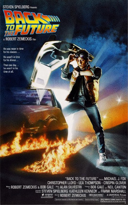
Movie posters don't get much more perfect than this one. Just look at it. Take it all in. Every element is perfect: the iconic logo, the flaming tire tracks, the badass car that was badass only in the fictional sense, and Michael J. Fox looking at his watch in abject shock, because apparently movie Swatches display what year it is.
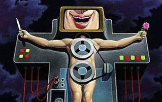
The Poster We Almost Got Instead:

Disappearing: Marty, Interest in seeing this movie.
Renowned poster artist Drew Struzan is responsible for every movie poster you ever wanted to thumbtack to the back of your bedroom door as a kid. But when he first heard the plot synopsis for Back to the Future, he apparently stopped listening both before and after "1950s," and the result was this tragically flaming-tire-track-free bit of boring-ass Americana.
Why are we seeing only Marty's and his not-yet parents' feet, and just who's kissing whom here? (Talk about a temporal paradox.) Marty's dad either has to pee real bad or he's hiding a disconcerting boner, and the logo looks like that of a defunct indie bookstore. And those Nikes that seem to be the entire focus of the image aren't even the ones Marty wears in the movie -- his don't have black trim.
What? We're not the only ones who knew that.
Still, we guess it's better than turning Marty into a Mickey Mouse watch against the backsplash of a veritable spoiler parade, which was totally another idea that was tossed around:
That's funny; we don't remember Doc Brown opening the Ark of the Covenant.
The Fly: Getting It Precisely Backwards
The Poster We Got:

This poster says it all. With a single glance, we know that we're going to witness some kind of ungodly combination of man and fly, and because it's a David Cronenberg film we can reasonably infer that said combination will induce copious amounts of pants-pissing, and also vomiting. So much vomiting.
The Poster We Almost Got Instead:

"Be irritated.
Be mildly irritated."
This rejected draft is what happens when a poster artist hears "Jeff Goldblum turns into a human-fly hybrid" and thinks, "Holy shit, that sounds hilarious." And he was absolutely right.
We'd not only watch that movie, we'd watch the ever-loving hell out of that movie. Just imagine it: Goldblum-fly buzzes around stammering pseudoscientific diatribes in people's ears, trying in vain to get someone to help transform him back into non-insect-Goldblum, only no one understands because all they hear is buzz buzz. Cue a cartoonish shooing sequence in which he's all, "AAAHH! I don't know how to properly control my tiny fly body!" before landing in the trashcan with a plop. Then he finds some dumpster meat and, before you know it there's an entire army of adorable little Goldblum-faced maggots squirming around.
Man, it's weird how easy it is to hop right over that thin line between hilarious and terrifying.

Jurassic Park: Beware the Ghost Dino
The Poster We Got:

Jurassic Park.
A T. rex.
A Steven Spielberg Film.
With a few simple elements, this poster perfectly ensnares the movie's target demographic (that is, human beings who are also sometimes conscious).
The Poster We Almost Got Instead:

All Dinosaurs Go to Heaven
Here we have the totemized cast looking on with expressions that include complete horror (Lex Murphy), complete uninterest (John Hammond, Alan Grant, and Ian Malcolm), "Who farted?" (Ellie Sattler), and "DUR!" (Tim Murphy), as Mufasa T. rex threatens to go full-on dino-Thor on a jeep.
Though you'd never know it from its superlative shittiness, this quickly nixed poster was designed by none other than John "Yeah, I did the goddamn Blade Runner poster" Alvin. And we were only kidding about the Mufasa thing, but lookee what he did almost exactly one year later:

"Remember who you are, Simba. A T. rex. You are a T. rex."
You know what they always say: if at first your heavy-handed cloud imagery doesn't cut Spielberg's mustard, just recycle that shit for Disney.
Never Say Never Again: Ramping a Motorcycle off a Giant Skull
The Poster We Got:

1983 will forever go down in history as the year in which Motorola launched the first publicly available cellphone, as well as the one in which movie audiences got to watch two new James Bond films in the same year. Octopussy is a Roger Moore flick that somehow manages to stretch one ludicrous title into two full hours of squirming innuendo, while Never Say Never Again readily demonstrates its superiority over its more "official" rival by featuring its most notable element front-and-center on its poster: Sean "the one and only true Bond" Connery, returning to the role after a decade-long absence.
The scantily clad flashdancers are just the icing on the Connery cake.
The Poster We Almost Got Instead:

Sean Connery
Is Evil Knievel in
Holy Shit, What Is Even Happening Right Now?
If the name Boris Vallejo doesn't ring any bells, then we can safely assume two things about you. First, you are not a male who grew up reading fantasy fiction, and second, hearing the word "dragon" doesn't trigger confusing stirrings in your nether regions. (We call it the "Pavlov's dong" response.)
Vallejo is the preeminent fantasy artist known for featuring buttloads of ultra-realistic boobs (also, butts) in his paintings, so who better to illustrate Connery's triumphant return to the similarly boob-filled Bond franchise? That's what the studio thought too, and the result was an aging Bond nonchalantly flying out of the eye socket of a giant skull on a rocket-cycle just to impress a couple of gun-toting bikini models. It's at once infinitely ridiculous and undeniably awesome. Did you notice the giant skull is in the process of eating the babe on the right?
Jaws: A Made-for-TV Comedy
The Poster We Got:

One naked woman, one flawless one-word title, one giant shark, one bazillion ragged teeth. There's quiet tension embedded right into the image -- it's all about what's about to happen.
The Poster We Almost Got Instead:

Jaws: The Musical! Featuring "Sharks Bite (but Love Bites Harder)"
and "You're Going to Need a Bigger Heart."
This one gets more hilarious the longer you look at it. Check out that guy's face. His body language. He's not terrified or in unfathomable pain -- he's ecstatic. The only thing missing is a big ol' word balloon spelling out the "Wheee!"
This version of Jaws apparently follows the "man meets giant creature, man struggles against giant creature, man falls for giant creature" formula later made popular by Beethoven. Its poster is an unabashed spoiler of the final scene, in which the man's newfound toothy friend bounces him off into the sunset (cue credits). Sure, that monster may have sunk his boat, eaten half his family and all his friends, and brought about his need for a lifetime supply of peg legs, but that's all in the past now, because who's a good little Jaws? You're a good little Jaws! Yes you are!
The Exorcist: A Wacky '70s Sitcom
The Poster We Got:

The Exorcist bears the distinction of having accomplished the nigh impossible task of making pea soup even more awful than it already is. Even if you've never seen the movie and you've also somehow avoided having been baby-bird-fed its basic plot via decades of media regurgitation, one glance at this foreboding poster tells you precisely what you're in for (irrepressible pants-shitting).
The Poster We Almost Got Instead:

Ten bucks says the original trailer featured "Solsbury Hill."
This rejected version, on the other hand, sells the movie as if it was meant to compete with The Brady Bunch. That font makes us feel downright giddy, and we're anxiously awaiting Seth Rogen's '70s doppelganger to stumble into his first scene as the hungover, last-resort babysitter of a (wackily!) demonically possessed little girl. We hear the pea soup scene is an honest-to-goodness knee-slapper.
If we didn't know better, we'd say this was the studio's attempt at pulling a fast one on mainstream audiences of the early 1970s, before the execs realized that would be a class-action lawsuit in the making.
Evan V. Symon is the interview finder guy for Cracked. If you have an awesome experience or job you would like to see as a Cracked article, hit up the tipline at tips@cracked.com.
For more bizarre posters, check out 8 Classic Movies with Shitty Posters and 14 Hilariously Inaccurate Foreign Posters for American Films.
Are you on reddit? Check it: We are too! Click on over to our best of Cracked subreddit.
