The Bizarre Origins of 15 Famous Logos

It’s important for a business to have a good logo, lest people start making up entire conspiracy theories to explain why your graphic design sucks so hard. In the quest for that perfect logo that will stand out but not in a bad way, companies have reached back into the scary, briny depths of human creativity, taking inspiration from everything from strip clubs to Greek gods.
CBS

That’s no random eye, symbolizing the keen gaze of the media or whatever. It was inspired by Shaker symbols intended to ward off evil spirits, although it seems like Walter Kronkite was just as good.
Chupa Chups

You’d never know it from the lack of ants or anything decaying, but the Chupa Chups lollipop logo was designed by Salvador Dali during his “anything for money” phase in 1969. It helped that the founder was a personal friend of Dali’s, so he definitely earned it, putting up with his pet ocelot and shit.
Apple
Apple seems like a uniquely easy company to design a logo for, being an object that exists in the world and all, but it still presented its challenges. You might have heard that the bite in the Apple has something to do with Adam and Eve or Alan Turing, but it was actually just so people wouldn’t think it was a cherry. “Kind of a let down,” its designer agrees with you.
Starbucks

The original Starbucks mermaid would have been immediately kicked out of your local shopping center, with big, heavy naturals she let swing free in front of Claire’s and everybody. It was supposedly inspired by a 16th-century Norse woodcut, but those words don’t make sense together. It probably actually came from the artwork in a 15th-century German book.
McDonald’s

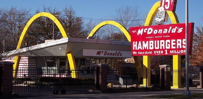
The golden arches were adopted as an ode to the ones that framed the original restaurant, but they were kept because they were Freudian. During a branding overhaul in the ‘60s, one psychologist advised them to keep the logo because it “symbolized a mother’s nourishing breasts.”
Nike
The li’l swoosh actually has a meaning: It represents the wings of the Greek goddess of victory, whose name is … Nike. It also represents motion and speed and stuff, but it’s mostly the goddess thing.
Michelin

This mind-blowing about the Michelin Man comes in four parts: 1) He has a name. 2) That name is “Bibendum.” 3) He’s made of tires. 4) He partied like a rock star. Early advertisements featuring the Michelin Man from the late 19th century often depicted him smoking a cigar and drinking champagne, though he sometimes drank coupes full of nails and broken glass because “the Michelin tire drinks up obstacles.” Basically, he was Teddy Roosevelt.
MGM

The first MGM lion was apparently such a beast that he was buried under a marble slab to “hold down the lion’s spirit,” as if it might leap out and turn someone awesome via possession, but that’s nothing compared to the next one, who was the first to actually roar. This dude, named Jackie, survived a ridiculous number of catastrophes, including a boat sinking, two train wrecks, and “a plane crash that left him stranded in the Arizona wilderness for several days.” Oh, he also adopted a litter of alley cats. Why hasn’t Marvel given this guy a movie?
Nirvana
Although currently embroiled in a lawsuit from their record label’s former art director, who insists that he created the logo, Nirvana’s official story is that Kurt Cobain drew the band’s twisted smiley face, though he can’t take full credit, either. Many local fans have noted that the logo is very similar to one displayed on the marquee for the recently departed Seattle strip club the Lusty Lady.
Sriracha

The Sriracha logo is a rooster because that’s the founder’s Chinese zodiac sign, but he got it from a random street artist in Vietnam in the ‘70s who he never saw again. He didn’t even keep the sketch, so there’s no basis for a Searching For Roosterman-type documentary.
NBC

What do peacocks have to do with television? Something, it turns out. The peacock was designed to show off the jaw-dropping capabilities of color TVs -- specifically those manufactured by NBC’s parent company, RCA -- which had just hit the market. We know what you’re thinking: Peacocks don’t really look like that, and there are much better symbols, like rainbows, for displaying a variety of colors. We can’t all be branding geniuses.
Coca-Cola
Speaking of colors, Coca-Cola’s association with the color red goes back to the days when it was sold in barrels. Booze was also sold in barrels, and that was taxed, so to eliminate any confusion (and possibility of paying one cent more than necessary), Coca-Cola painted their barrels red.

On the other hand, red was one color the Facebook logo absolutely couldn’t be because Mark Zuckerberg is red-green colorblind. “Blue is the richest color for me -- I can see all of blue,” he later explained, because that’s Mark Zuckerberg’s top business concern: Mark Zuckerberg.
Lots of logos have hidden designs in them, but Pinterest’s is possibly that most clever. That’s not just a fancy cursive P -- it’s actually a needle and a loop of thread. Because you click on it to pin stuff, you see. Get it? Do you get it? Please tell us you get it.
Gucci

Those two interlocking G’s don’t just stand for the brand name -- they’re actually the initials of the founder. Yes. The poor man’s name was Guccio Gucci.
Top image: Omar Lopez/Unsplash