The 7 Most Ridiculous Rough Drafts of Famous Brand Logos
Most successful brands have instantly recognizable logos. However, early drafts of some of the most famous logos in the world apparently confused "recognition" with "bitter insanity."
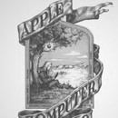
Apple Computers - 1976
Pretty much everyone is familiar with the logo for Apple Computers, because it permeates virtually every level of hipster culture.

We're amazed it doesn't have a beard.
However, when it first started up in 1976 (before Forrest Gump stepped in), they were using a much different logo drawn by Ronald Wayne:

Everything about this picture deafeningly screams "computers."
Steve Jobs and friends decided that an 18th century woodcut of Isaac Newton was perhaps too pretentious, even for Apple, and they switched to the now-famous multi-colored apple the very next year.
Canon Cameras
Today, Canon cameras are known worldwide, with an elegantly simple logo designed by someone who was clearly in a hurry to go to lunch.

"Shouldn't we put 'cameras' in there somewhere?"
"... fuck you ."
However, the company was originally called Kwanon, and back in 1934 they decided a flaming Buddhist statue was the best way to sell cameras without a trace of terror and confusion.

"Free ritual sacrifice with every purchase!"
When this turned out not to be the case, they changed both the logo and the name.
Denver Nuggets 1974 - 1981
In 1967, the Denver Rockets joined the ABA (which was sort of the RC Cola to the NBA) with easily the worst possible logo one could produce during the Cold War:

It looks like the logo a child molester would create for a fake summer camp.
In anticipation of an NBA merger, the Denver Rockets decided to change their name to the Nuggets and created a new mascot that looked like Yukon Cornelius if he played for the Harlem Globetrotters.

However, when attendance started dropping, they changed the logo again and immediately began playing better, because the Prospector was apparently terrible enough to affect both enjoyment and athleticism.
Pizza Hut
Pizza Hut has been giving people diarrhea for years with the same matching-logo-and-restaurant advertising strategy.

The red symbolizes your inflamed anus.
But way back in 1958, Pizza Hut decided to try out a mascot named Pete, who looked like a police sketch of a man trying to lure children into a dark room.

"Kids, don't forget to ask your parents about my camp!"
By 1967, Pizza Hut decided on the familiar Red Hut logo, which is marginally less creepy and unsettling.
Mountain Dew
Mountain Dew's logo has been slowly growing more and more stupid over the years to appeal to a very specific group of people that has absolutely no time for vowels:

"Fck ltrcy."
But the original logo had almost the exact same contempt for written English, and for decency in general:

Within a specific context, "It'll tickle your innards" is the most horrifying threat a person could make.
"Mountain Dew" was a term used for moonshine, which explains why a person would think of hillbillies, but not why a company would elect to use them as product spokesmen. In fact, they once marketed the soda as "zero proof moonshine." Another early label showed one hillbilly shooting at another while he ran for cover behind a still, because hillbillies aren't hillbillies unless they're drunkenly murdering each other.
Even if you don't have a Facebook, chances are you know the logo:

But the very first logo of "The Facebook," as it was known at the time, was a mysterious face that looked like a haunted underwear ad. So every time you signed in, you were welcomed by the vacant stare of a handsome ghost.

Which sadly means there was never a point at which a woman could be a member without a creepy stranger eying them.
So who is that? Is it even a real person, or just a computer-generated image?
Actually, it's a picture of Al Pacino. So technically both are correct.
Nickelodeon
Most of us grew up watching Nickelodeon. Their delightful orange and white logo was the closest thing some of us had to a babysitter (or parents):

When Nickelodeon unveiled its first logo back in 1979, however, they inexplicably decided on a lifeless charcoal rubbing of a steampunk enthusiast railing lines of cocaine.

Although this would explain how Ren and Stimpy got past their censors.
We understand he's supposed to be looking into a nickelodeon machine, but no little kid on the face of the planet is going to know what the hell that is. Nickelodeon figured this out and switched to a more eye-catching, kid-friendly logo, because they wanted to keep their jobs.
Evan V. Symon is a Moderator in the Cracked Workshop. When he isn't being awed by mascots from the 1960s , he can be found on Facebook with a new book serial out at JukePop Serials. Kier has a Twitter and a blog that he updates. Sometimes.
